Theming
Canon's theming is built entirely on CSS, without relying on any CSS-in-JS libraries. At its core, it provides a solid default theme that is easily customizable using a comprehensive set of CSS variables. Additionally, it enables anyone to adapt the design to their specific needs. Each component comes with fixed class names, making customization even more straightforward.
Light & Dark modes
By default, Canon supports both light and dark modes using the data-theme attribute.
The light theme is applied by default if no data-theme attribute is specified. To create
a custom theme, you'll need to define both light and dark modes as outlined below. If
only one mode is defined, the other will fall back to the default theme.
How to create your own theme
In our started guide, we ask you to import two css files. The core.css file includes
the default set of variables. We recommend to keep this file in place and add your own theme
on top of it. core.css also include an opinionated reset. If you decided to remove core.css
you will have to provide your own reset css.
Here's an example of how your theme.css file should look like:
:root {
  --canon-font-regular: system-ui;
  --canon-font-weight-regular: 400;
  --canon-font-weight-bold: 600;
  --canon-bg: #f8f8f8;
  --canon-bg-surface-1: #fff;
  /* ... other CSS variables */

  /* Add your custom components styles here */
  .canon-Button {
    background-color: #000;
    color: #fff;
  }
}

[data-theme='dark'] {
  --canon-font-regular: system-ui;
  --canon-font-weight-regular: 400;
  --canon-font-weight-bold: 600;
  --canon-bg: #f8f8f8;
  --canon-bg-surface-1: #fff;
  /* ... other CSS variables */

  /* Add your custom components styles here */
  .canon-Button {
    background-color: #000;
    color: #fff;
  }
}
CSS class name structure
All Canon components come with a set of CSS classes that you can use to style them. To make it easier to identify the class name you can use, we use a specific structure for the class names.
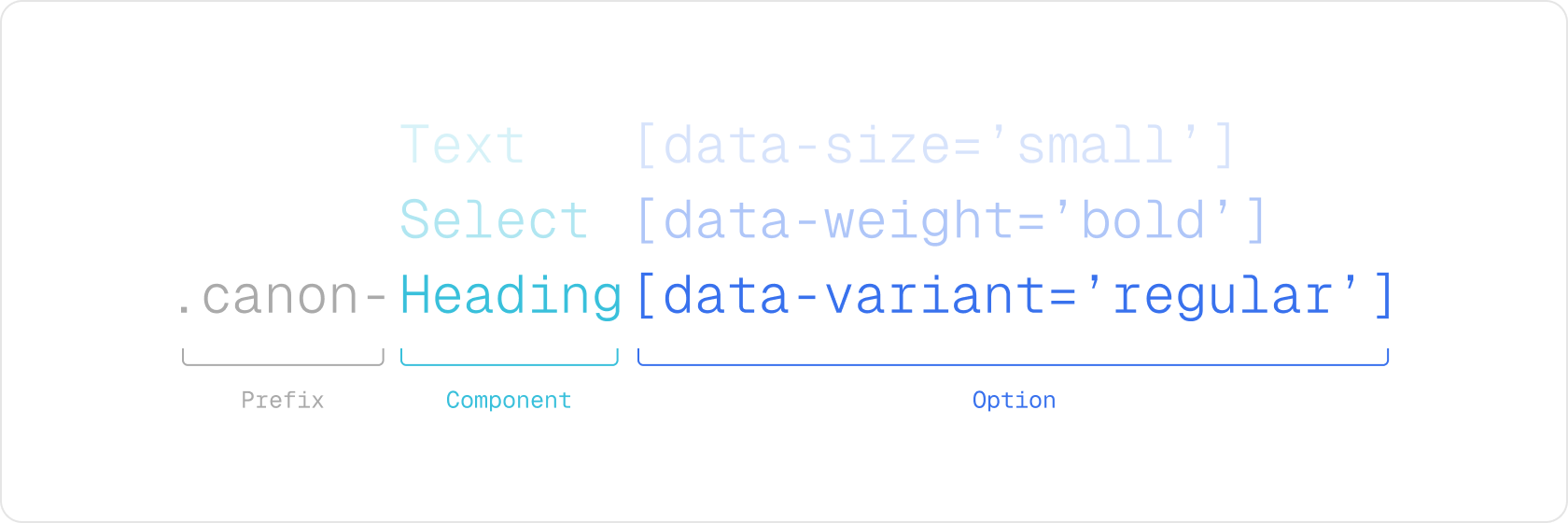
Every component has a unique prefix .canon- followed by the component name. Component props
are represented using the data- attribute. That way, class names are easily identifiable.
Available CSS variables
Base colors
These colors are used for special purposes like ring, scrollbar, ...
| Prop | Description |
|---|---|
| --canon-black | Pure black color. This one should be the same in light and dark themes. |
| --canon-white | Pure white color. This one should be the same in light and dark themes. |
| --canon-gray-1 | You can use these mostly for backgrounds colors. |
| --canon-gray-2 | You can use these mostly for backgrounds colors. |
| --canon-gray-3 | You can use these mostly for backgrounds colors. |
| --canon-gray-4 | You can use these mostly for backgrounds colors. |
| --canon-gray-5 | You can use these mostly for backgrounds colors. |
| --canon-gray-6 | You can use these mostly for backgrounds colors. |
| --canon-gray-7 | You can use these mostly for backgrounds colors. |
| --canon-gray-8 | You can use these mostly for backgrounds colors. |
Core background colors
These colors are used for the background of your application. We are mostly using for now a
single elevated background for panels. --canon-bg should mostly use as the main background
color of your app.
| Prop | Description |
|---|---|
| --canon-bg | The background color of your Backstage instance. |
| --canon-bg-surface-1 | Use for any panels or elevated surfaces. |
| --canon-bg-surface-2 | Use for any panels or elevated surfaces. |
| --canon-bg-solid | Used for solid background colors. |
| --canon-bg-solid-hover | Used for solid background colors when hovered. |
| --canon-bg-solid-pressed | Used for solid background colors when pressed. |
| --canon-bg-solid-disabled | Used for solid background colors when disabled. |
| --canon-bg-tint | Used for tint background colors. |
| --canon-bg-tint-hover | Used for tint background colors when hovered. |
| --canon-bg-tint-focus | Used for tint background colors when active. |
| --canon-bg-tint-disabled | Used for tint background colors when disabled. |
| --canon-bg-danger | Used to show errors information. |
| --canon-bg-warning | Used to show warnings information. |
| --canon-bg-success | Used to show success information. |
Foreground colors
Foreground colours are meant to work in pair with a background colours. Typeically this would work
for icons, texts, shapes, ... Use a matching name to know what foreground color to use. These colors
are prefixed with fg to make it easier to identify.
| Prop | Description |
|---|---|
| --canon-fg-primary | It should be used on top of main background surfaces. |
| --canon-fg-secondary | It should be used on top of main background surfaces. |
| --canon-fg-link | It should be used on top of main background surfaces. |
| --canon-fg-link-hover | It should be used on top of main background surfaces. |
| --canon-fg-disabled | It should be used on top of main background surfaces. |
| --canon-fg-solid | It should be used on top of solid background colors. |
| --canon-fg-tint | It should be used on top of tint background colors. |
| --canon-fg-tint-disabled | It should be used on top of tint background colors when disabled. |
| --canon-fg-danger | It should be used on top of danger background colors. |
| --canon-fg-warning | It should be used on top of warning background colors. |
| --canon-fg-success | It should be used on top of success background colors. |
Border colors
These border colors are mostly meant to be used as borders on top of any components with low contrast to help as a separator with the different background colors.
| Prop | Description |
|---|---|
| --canon-border | It should be used on top of |
| --canon-border-hover | Used when the component is interactive and hovered. |
| --canon-border-pressed | Used when the component is interactive and focused. |
| --canon-border-disabled | Used when the component is disabled. |
| --canon-border-danger | It should be used on top of --canon-bg-danger. |
| --canon-border-warning | It should be used on top of --canon-bg-warning. |
| --canon-border-success | It should be used on top of --canon-bg-success. |
Special colors
These colors are used for special purposes like ring, scrollbar, ...
| Prop | Description |
|---|---|
| --canon-ring | The color of the ring. |
| --canon-scrollbar | The color of the scrollbar. |
| --canon-scrollbar-thumb | The color of the scrollbar thumb. |
Font families
We have two fonts that we use across Canon. The first one is the sans-serif font that we use for the body of the application. The second one is the monospace font that we use for code blocks and tables.
| Prop | Description |
|---|---|
| --canon-font-regular | The sans-serif font for the theme. |
| --canon-font-mono | The monospace font for the theme. |
Font weights
We have two font weights that we use across Canon. Regular or Bold.
| Prop | Description |
|---|---|
| --canon-font-weight-regular | The regular font weight for the theme. |
| --canon-font-weight-bold | The bold font weight for the theme. |
Spacing
We built a spacing system based on a single value --canon-space. This value is
used to calculate the spacing for all the components. By default if you would like to
increase or decrease the spacing between your components you can do it simply by updating
--canon-space and it will apply to all spacing values.
--canon-space is not used directly in any components but serve as an easy way to
calculate the other values.
| Prop | Description |
|---|---|
| --canon-space | The base unit for the spacing system. Default value is |
Below is the list of all spacing values you can use in your application. We use these tokens for pretty much each spacing properties like padding, margin, gaps, ...
| Prop | Description |
|---|---|
| --canon-space-0_5 | Base unit (--canon-space) times 0.5. |
| --canon-space-1 | Base unit (--canon-space). |
| --canon-space-1_5 | Base unit (--canon-space) times 1.5. |
| --canon-space-2 | Base unit (--canon-space) times 2. |
| --canon-space-3 | Base unit (--canon-space) times 3. |
| --canon-space-4 | Base unit (--canon-space) times 4. |
| --canon-space-5 | Base unit (--canon-space) times 5. |
| --canon-space-6 | Base unit (--canon-space) times 6. |
| --canon-space-7 | Base unit (--canon-space) times 7. |
| --canon-space-8 | Base unit (--canon-space) times 8. |
| --canon-space-9 | Base unit (--canon-space) times 9. |
| --canon-space-10 | Base unit (--canon-space) times 10. |
| --canon-space-11 | Base unit (--canon-space) times 11. |
| --canon-space-12 | Base unit (--canon-space) times 12. |
| --canon-space-13 | Base unit (--canon-space) times 13. |
| --canon-space-14 | Base unit (--canon-space) times 14. |
Radius
We use a radius system to make sure that the components have a consistent look and feel.
| Prop | Description |
|---|---|
| --canon-radius-1 | The radius of the component. Default value is |
| --canon-radius-2 | The radius of the component. Default value is |
| --canon-radius-3 | The radius of the component. Default value is |
| --canon-radius-4 | The radius of the component. Default value is |
| --canon-radius-5 | The radius of the component. Default value is |
| --canon-radius-6 | The radius of the component. Default value is |
| --canon-radius-full | The radius of the component. Default value is |